


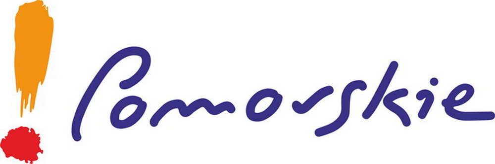
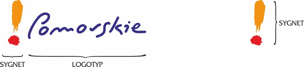
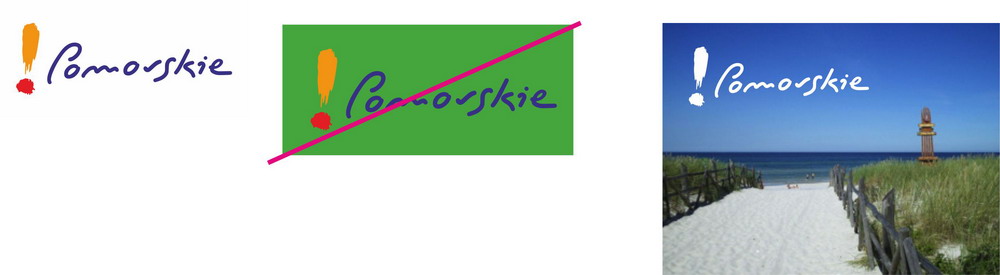
The symbol, in the shape of a brush-painted exclamation mark, is placed to the left of the logotype.
Its upper part is an energetic orange, the dot is red.
The symbol is unique and was painted with a brush specifically for the promotional graphic.
The Pomorskie logotype is handwritten in navy blue, designed specifically for this brand. The custom lettering gives the graphic a unique character.
It is not allowed to independently modify the colors or shape of the promotional graphic.
Only proportional resizing is permitted; there is no limit on maximum size.
The graphic is a closed composition and cannot be distorted in any way.
It is not allowed to use the logotype without the symbol.
The usage standards for the promotional graphic are defined in the Regulation.
DEFAULT VERSION SYMBOL
The default version is the full-color variant.
It is recommended to use the default version in all promotional and informational materials as well as print documents.
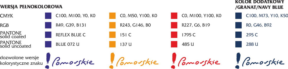
2. COLOR DESCRIPTION OF THE PROMOTIONAL GRAPHIC
The main colors are navy blue, orange, and red.
These primary colors are precisely defined in the most popular color systems to ensure consistent reproduction across printing, multimedia, internet, and other media.
Print – Pantone Matching System and CMYK
Internet and multimedia – RGB
Outdoor signage – RAL
ANY GRAPHIC MODIFICATION (other than proportional scaling respecting minimum size, color scheme, and safe area) REQUIRES APPROVAL from the Department of Promotion and Social Communication (tel. 58 32 68 296, e-mail: promocja@pomorskie.eu).


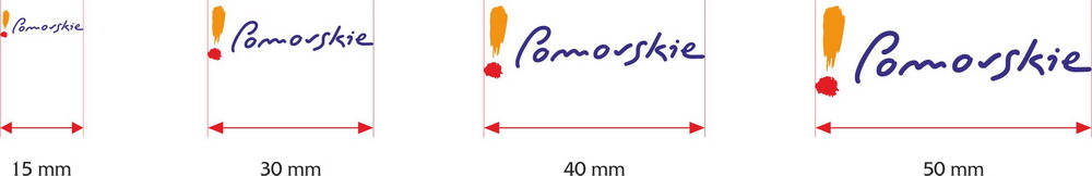
3. MINIMUM SIZE OF THE SYMBOL
The minimum size defines the smallest width at which the graphic remains fully legible. For the promotional symbol, this width is 15 mm.
If this minimum size does not ensure legibility in production, it is recommended to enlarge the graphic accordingly.
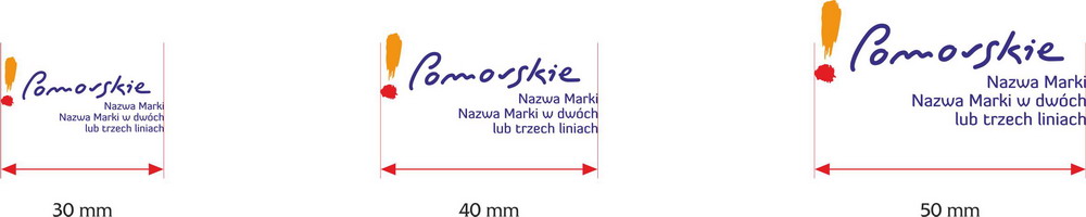
4. PROMOTIONAL GRAPHIC WITH A SLOGAN
The minimum size defines the smallest width at which the graphic remains fully legible. For Pomorskie group brand graphics, this width is 30 mm.
If this size does not guarantee proper legibility during production, enlarge the entire graphic (symbol, logotype, and brand name) accordingly.
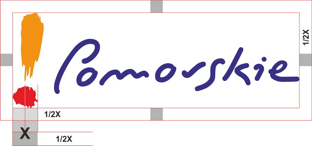
5. SAFE AREA OF THE SYMBOL
The safe area is a space around the promotional graphic free of any text or graphic elements that might compromise its identity or readability.
It also defines the minimum margin from the edge of the material.
The safe area is defined as 1/2 the width of the dot in the symbol.
6. PROMOTIONAL GRAPHIC – TYPOGRAPHY – PRIMARY FONT
The primary font for Pomorskie brand identity is Diavlo.
This is a free font downloadable from sites like http://www.fontsquirrel.com/fonts/diavlo
This font and its related styles are used for group identity elements.

7. USING THE GRAPHIC ON BACKGROUNDS
Care should be taken to place the promotional graphic on a white background.
Do not place the full-color version on contrasting backgrounds.
Use an appropriate color version of the logo to ensure legibility.
In the case of photos or uneven backgrounds (flat colors), the graphic can only be used against a dark solid color background that ensures legibility.
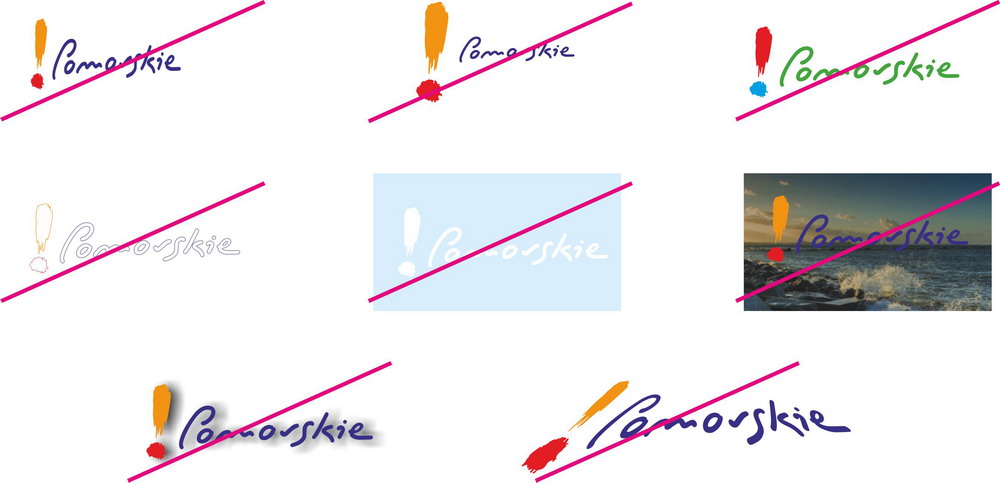
8. PROHIBITED USE OF THE GRAPHIC
You may not modify the proportions of the promotional graphic.
You may not alter the proportions between the symbol and the logotype.
You may not change the color scheme of the graphic.
You may not outline the graphic.
You may not place it on light backgrounds that hinder legibility.
You may not use the colored version on photos that interfere with its visibility.
Bevels, shadows, and perspective effects are not permitted.